A Quiet Image

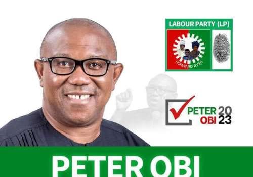
Peter Obi’s 2023 presidential campaign poster is not like the usual loud and crowded Nigerian political posters. It is calm, simple, and softly commanding. It doesn’t force attention it invites it. Using formal media analysis, we can see that this poster uses visual elements like colour, typography, image placement, and symbolism to speak clearly about Peter Obi’s leadership style, political values, and his goal for national unity. The way everything is arranged his photo, the colours around him, the text all come together to form a quiet but powerful message. It’s not just a campaign poster; it’s a visual statement about the kind of leader he wants to be seen as.
One of the first things that stands out about the poster is the colour. It uses a soft peach tone with a clean white background, which is very different from the usual deep green or red most political posters in Nigeria use. Peach is not a common political colour, and that’s what makes it special here. It gives off a warm, calm feeling almost like a quiet sunrise or a fresh start. This makes the poster feel peaceful and modern. White represents honesty and transparency, and the fact that it is used so freely in the background suggests a clean and clear approach to politics. There is also a small touch of green, which quietly connects the design back to Nigeria’s national colours without shouting it. These colours are carefully chosen to make people feel that Peter Obi is different fresh, trustworthy, and ready to bring calm change to the country.
Typography also plays a major role in how the message of the poster is communicated. The name “OBI” is written in bold, capital letters, and it immediately grabs attention. It looks firm and direct. Underneath it, the slogan is written in smaller, lighter font, probably a sans-serif typeface. This makes the slogan feel approachable, modern, and sincere. The boldness of the name shows strength and confidence, while the lightness of the slogan balances it with humility. The combination of both font weights creates a visual rhythm that says: “I’m serious about change, but I’m also calm, open, and ready to listen.” The typography is not shouting, it is speaking clearly. That clarity helps reinforce the kind of leadership Obi is promising clear, thoughtful, and not aggressive.
The placement of Peter Obi’s image on the poster also tells a story. His portrait is right in the center, with his face looking directly at the viewer. He is dressed simply and confidently, not overly styled or intimidating. His gaze is direct but calm — it feels like he’s talking to you, not talking down at you. There is enough space around his photo to make the poster feel clean and uncluttered. This central placement makes it obvious that he is the main focus, but the simplicity makes it feel more like a conversation than a command.
The way his image is framed suggests that he is open, present, and ready to take responsibility. He is not hidden behind a party symbol or crowded by flashy designs. It’s just him, standing firm in his identity.
There is also symbolism in the poster, though it is subtle. Unlike most political posters that splash party logos everywhere, Obi’s poster is soft in its use of symbols. The shape of Nigeria is faintly present, and the design hints at national unity without being loud about it. The poster does not rely heavily on cultural images, handshakes, or traditional cloth to show “Nigerianness.” Instead, it focuses on the idea that change can be calm and collective. That choice says something important: it’s not about showing off identity it’s about building a shared future. The quiet presence of green lines and national outlines shows that Obi is not ignoring Nigeria’s history or culture, but he is choosing to focus on where the country can go, not just where it’s been.
Looking at all these elements together, it becomes clear that the poster is intentionally designed to communicate specific political values. The soft colour tone shows peace and honesty, the clean font and central image show clarity and focus, and the subtle use of symbols speaks to national unity. All of these choices add up to a leader who is saying: “I’m not here to confuse or entertain — I’m here to work.” The aesthetics reflect his message and the identity he wants to project calm strength, clear thinking, and a serious commitment to building a better Nigeria. The poster makes you feel like this is someone who doesn’t just want power; he wants purpose.
The design also distances itself from the noise and drama that usually surrounds Nigerian elections. There are no promises slapped across the page in all caps, no forced slogans, no distractions. That minimalism itself is a political act. It tells the viewer that Peter Obi’s campaign is about substance, not show. It places trust in the intelligence of the Nigerian people by giving them a clean and honest presentation, rather than trying to manipulate them with flashy colours or dramatic words. In a time when many people are tired of noise and corruption, this quiet poster becomes a symbol of something new a politics of decency, focus, and calm confidence.
In conclusion, Peter Obi’s presidential campaign poster does more than promote a candidate. It communicates a vision. Through thoughtful colour choices, strong but soft typography, clean image placement, and gentle national symbolism, it tells the story of a leader who wants to bring calm, clarity, and unity. It avoids the usual political chaos and instead offers a fresh, simple, and powerful visual message. Every element is intentional, and together, they form a design that reflects Obi’s message: serious leadership, honest change, and a better future for all Nigerians.
Comments
Post a Comment